Showing posts with label portfolio. Show all posts

Wednesday, July 3, 2013

[Portfolio] Shangri-La

I recently completed a design job for a client in the Shangri-La Residences. It was a capsule commission for permanent upgrades consisting of colour selections, light fixtures, and some custom millwork in the hallway.


The unit started out in the customary builder basic beige with a severe visual imbalance because of the floor-to-ceiling dark cabinets on the far wall of the open-concept main space. A colour for the fireplace surround was pulled from the marble to not only give weight to that side of the room and add balance but also to accentuate the unique bulkhead geometry.


A matte black quad halogen fixture with installed over the fireplace. The clean lines and colour echo the fireplace design and draw the eye up to the high ceilings.


A custom chandelier illuminates the dining area.


To keep with the modern lines of this condo I chose a minimal, clean moulding profile and jettisoned the center chair rail found in traditional panel moulding altogether. The panels were then configured so that the negative space between the top and bottom frames works in its place.


View from first corner.


View of first corridor.


This glass cylinder chandelier is a one-of-a-kind custom piece that was fabricated by modifying and combining two store-bought fixtures.

Some Before and Afters:

Monday, May 20, 2013

[Portfolio] Black & Gold

Over the past few weeks I've been working on a display unit transformation for Loulle. Here is the Before & After:

The original structure was stripped right down to the frame and custom drawer units and fronts, leather backing, and trim work was installed.

To display fabric samples, custom hang rails were installed plus a pull rail on the front edge. I am particularly proud of the custom hardware as it was created from readily available store-bought materials to keep costs low.

Friday, July 15, 2011

[Portfolio] Canyon Residence, Library

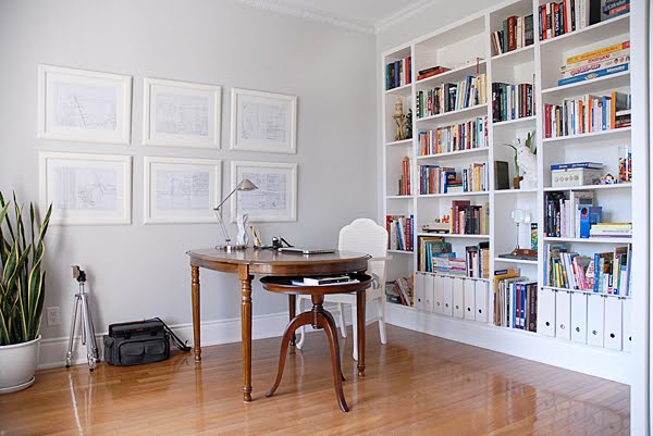
A custom full height built-in was installed on the north wall to create ample storage and trimmed to match the existing baseboards.

Five separate shelving units were custom fitted to the space and capped out with a false wall.

Trim moulding detail was installed on the front edge of where the units meet to conceal the seam and also create a more tailored look.

The client's love of old maps was the inspiration for the custom artwork. To create something of significance and meaning with a connection to the home, a trip was made to the local land registry office where a copy of the original land survey of the property and entire surrounding settlement was obtained. The survey map was accordian folded and “aged”, then divided into six segments and framed. The client’s lot can be seen in the bottom left-hand corner of the middle pane, top row.

Monday, July 4, 2011

[Portfolio] Canyon Residence, Living Room


Floor-to-ceiling custom millwork was installed throughout the living room to create a dramatic first impression. The diamond-tufted bench and bolsters upholstered in blue-grey silk were also custom-made for the space.


Custom chair rail and panel moulding was also installed on the lower half of the vestibule walls to define the area.


Thursday, June 30, 2011

[Portfolio] Canyon Residence, Upper Hallway


This second floor hallway was one of the client’s principal areas of concern. Situated in the centre of the house, it does not receive a great deal of natural light and this, combined with its substantial size, lended the area a cave-like atmosphere. The goal was to bring warmth and interest to the second floor landing while showcasing its spacious dimensions.

The walls were painted the same hue as the main floor hallway for continuity. Crown moulding was installed to draw the eye up and emphasize the high ceiling. Chair rail and panel moulding was installed on the lower half of the wall. Artwork was chosen to work with the colours in the space and positioned to echo the rhythm established by the millwork. Halogen track lighting was installed to create a gallery-like feel and bring out the texture of the woodwork; unlike a single ceiling fixture, individual adjustable heads allow for areas of light and shadow, creating dimension and drama.

Formerly a space largely ignored, it is now one of the most complimented areas of the house.

Friday, June 17, 2011

[Portfolio] Canyon Residence, Principal Bedroom


For this principal bedroom, inspiration came by way of its premier feature: a massive bay window overlooking an expansive green space. The five panes flood the room with ample natural light and when opened, steady winds reminiscent of an ocean breeze.

Crisp, white linens set off the deep wood furnishings to create an airy and serene environment with a hint of drama. Gold and toffee tones punctuate the space to add warmth while the walls and bedside tables are adorned with art and accessories that give a subtle nod to the coast.

Wednesday, June 15, 2011

[Portfolio] Canyon Residence, Principal Bath


This principal bath renovation presented some unique challenges. The client wished to retain the original tile work and cabinetry as it was all in excellent condition. Therefore, the mandate was to minimize the coral undertones while adding warmth and character to the space.

New granite countertops were installed along with all new bath fixtures, hardware, lighting, custom window treatments, wall colour, artwork, furniture, and accessories. The classic toile fabric (one of the client’s favourite patterns) was the starting point for this modern twist on French Country. Farmhouse-inspired trough faucets adorn the His & Hers sinks. Wrought iron, copper, and antique ceramic accessories ornament the raised soaker tub surround and add rustic charm.

Thursday, May 19, 2011

[Portfolio] Makeover of the Week: Colonial Splat Back Armchair


I found this chair at a rummage sale for $25. It didn't look like much at first; it was a pretty inscrutable colour, had a stained and saggy seat, plus a cosmetic hairline crack on the back of the shoulder piece. But it had good lines. Sometimes you find a treasure and sometimes you make one and sometimes it's a little bit of both.

Friday, July 23, 2010

[Portfolio] Light Touch.


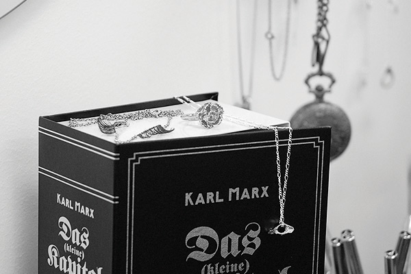
I love the look and feel of long, false lashes but since wearing them on your eyelids the conventional way is time-consuming, uncomfortable, and generally not a practical daily endeavour, I wanted to find another way to use them and this is what I came up with.


Even though the aggravation level for this project was at times sky-high, it was a lot of fun to make and I'm pretty happy with the final result. Seeing as how there are endless ways to modify the original design (lash and chain types, colour combinations, configuration, etc.), I'm anxious to try out some other ideas soon.

Monday, April 12, 2010

[Portfolio] Alice Was Here

Late last year I had the chance to work on my friend Fay Eagles' short film, Alice Was Here. It will be making its big screen debut as part of the Ryerson University Film Festival which takes place this year at the Royal Cinema, May 14-16. Please come out to see some of the great new work being created by the next generation of Canadian filmmakers. You can check out the official schedule here.

One of the style boards I did for wardrobe.

On set at the studio.

Tuesday, March 23, 2010

[Portfolio] Members Only

Some images from the very first shoot I styled for Geoffrey Knott last summer that I never got around to posting:

It was on location at an outdoor tennis club, very late, after dark. It got really cold and I recall feeling bad for our model who was changing in and out of an assortment of thin tops and short skirts. I don't remember her name but I do remember that she was a very good sport.

Somehow the park lights had either all burnt out or had been turned off. There might have been a curfew on account of the coyotes. The courts were right next to a playground and at one point, in between look changes, Sian, the makeup artist, and I stumbled around in the pitch to find the see-saw and some goofy fiberglass anthropomorphized animals on big springs that rock back and forth and all around.

Sian, atop a duck in a bowtie, slipped and got a Ked full of sand. Perched on the footholds of a frog in a top hat, I almost turned my ankle while attempting a mock showy dismount. We marveled at how bright the stars were without any man-made competition to drown them out or steal their thunder.

It was a good night and I remember it fondly. I haven't been on a see-saw since.

Tuesday, September 29, 2009

[Portfolio] Outstanding In Every Field.

Here's the final tear for the Hunter campaign I styled for Geoffrey Knott over the summer. The colour brights range is a recent addition to the line along with the high gloss finish. I really love the tone of this image and how clean and colour-blocked it is with the white denim and foliage. Our goal was to touch on Hunter's storied outdoor tradition while giving the brand a current, directional appeal and I think we did just that.


You can see more of Geoffrey's great work at geoffreyknott.com

Sunday, July 19, 2009

[Portfolio] Early Morning

My favourite shot from a recent shoot I styled for Geoffrey Knott. Our model, Gabrielle, was as sweet as she is beautiful.